
Quick(er) Note on ARIA and Windows High Contrast Mode
While ARIA attributes (representing roles, states and properties) coupled with CSS can be used to alter the semantics and visual appearance of an element (for example, creating custom buttons or links), by default Windows High Contrast Mode will ignore these shenanigans. This means that while a <button> or <a href=...> element will receive specific High Contrast styles depending on the chosen or customized user theme, <div role=button> and <div role=link> will initially receive styling as would any other generic <div>.
As an example:
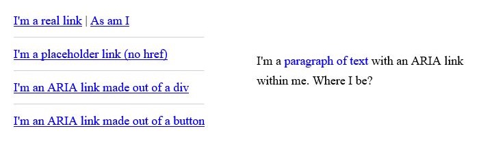
When Windows High Contrast Mode is enabled, many of these “links” are not colored as one might expect:
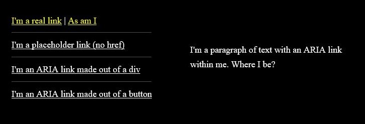
With WHCM turned on the true links receive the high contrast link coloring. The other elements that lacked an href attribute or were modified by ARIA to become links, do not match the high contrast coloring of links.
Note the faux link within the paragraph, where color alone was used to designate it as a link, as it is now indistinguishable from the static text around it.
Similarly, if attempting to identify a custom button as disabled, by using aria-disabled=true, it too will not be styled as a <button disabled> would have been.

button element and button with aria-disabled="true" are similarly styled when WHCM is enabled. The button with the disabled attribute is the only element that receives the disabled coloring in WHCM.
You can check the “button” demo out on CodePen.
If needing to create custom controls, then you also need to ensure the proper styling is applied. The following is a demonstration of how to re-apply base styles, or style a control specifically for WHCM. Notice the use of the legacy -ms-high-contrast and standard forced-colors media queries for broader support.
See the Pen styling a disabled button and "button" for WHCM by Scott (@scottohara) on CodePen.
You can read more about Styling for Windows high contrast with new standards for forced colors from a 2020 blog post by the MS Edge Team.
Background images used to be ignored
Background images are supported in all modern browsers for Windows High Contrast Mode. The content that was here has been commented out, as it is no longer accurate.
Read more about Windows High Contrast Mode
Off-colored elements and disappearing background images just graze the surface of things one should be aware of when designing for designing for high contrast mode.
For more information, check out the following links:
- Microsoft Is Working on a High Contrast Mode and Caret Browsing for Chromium by Ryan Maskell, 2019
- Microsoft Support: Use high contrast mode
- How to use
-ms-high-contrastby Greg Whitworth, 2017 - How users change colours on websites by Anika Henke, 2017
- OS: High Contrast versus Inverted Colors by Adrian Roselli, 2017
- Accessible SVGs in High Contrast Mode by Eric Bailey , 2016
- Windows High Contrast and Background Images by Terrill Thompson, 2011