
Visually hidden content is a hack that needs to be resolved, not enshrined
This will retread and extend on my previous Inclusively Hidden post. Specifically the parts about “visually hidden” content.
But in lieu of reading that, the reasons one would visually hide content in the development of a website or web application is generally to include extra content for accessibility. For instance, to mitigate against specific design choices, where visually something may be apparent, but programmatically not so much. Or, portions of UI are only need to be visible when needed, but otherwise they need to be hidden but remain accessible so that those using keyboard or assistive technology can find them.
The way to visually hide content, but keep it programmatically available, that is probably the most familiar to many developers is with the following CSS ruleset, or a variation of it:
/* sometimes referred to as .sr-only */
.visually-hidden:not(:focus):not(:active):not(:focus-within) {
  clip-path: inset(50%);
  height: 1px;
  overflow: hidden;
  position: absolute;
  white-space: nowrap;
  width: 1px;
}
For a breakdown of what each CSS property is doing, check out this dissection of the ruleset, by TPGi. Tbh, depending on your browser support matrix, I’ve found that there a few property declarations that can be removed with no negative impact for modern browsers/screen readers. Just something to think about. Maybe test this out n’ see if you can find something broken? I’m presently unaware of issues - so long as this is being used to just visually hide static content. As in, this ruleset is not intended to hide interactive controls. But just static content, or static content within an interactive control.
At the end of that TPGi article, the idea of consolidating this ruleset into a single CSS declaration, for example display: visually-hidden, was mentioned. This idea was also a brought up in “The Web Needs a Native .visually-hidden”, by Ben Myers. However, this is not a new idea, and has been brought up over the years. For instance, as a request for an HTML feature, and as different CSS WG issues from 2016.
Full disclosure, I have frequently used and have recommended the use of visually hidden content. It’s an important tool that we presently need to help mitigate accessibility gaps for content (design) as well as features of and related to common web UI. However, while a frequent recommendation, it’s one I would rather never recommend again. But, before we get into that and why I find the idea of the technique becoming any sort of web ‘standard’ rather icky, let’s review some situations where this ruleset is commonly used.
Examples of visually hiding content
Often, one will need a skip to main content link on their website or web application in order to adhere to WCAG’s 2.4.1 Bypass Block. The most common way of implementing this instance of a skip link is to visually hide it until it receives keyboard focus. One needs to be able to see what they’ve focused to know whether or not to try and interact with it. A skip link is a navigational mechanism primarily for a sighted keyboard user, after all.
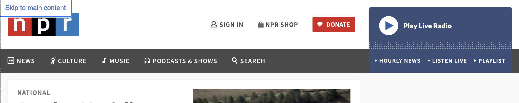
Not all news websites have a skip to main content link, but NPR.org does. They have a couple visually hidden skip links that become visible when they receive keyboard focus.
NPR uses a variation of the visually hidden class.
Or, one might visually hide pesky form controls so that they are still available to screen reader and keyboard users. But maybe you wanted to replace them with a fancy ‘custom’ control(s), allowing for more styling options.
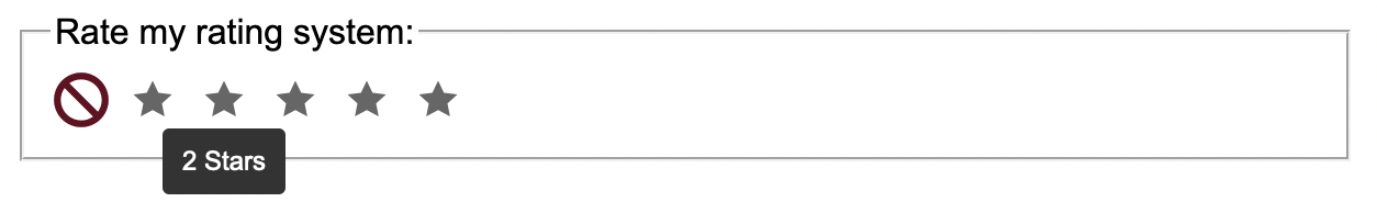
Visually styled to look like stars and a cancel icon, these are all native HTML radio buttons and would be exposed as such if styles were turned off or blocked.
Fun fact: these radio buttons don't use the 'typical' visually hidden class, either.
Alternatively, maybe you don’t need to restyle a control, but only want it available on hover and focus. That’s a thing we do to make it more difficult for sighted touch, switch device and speech recognition users to find initially hidden controls. I mean, to visually declutter UI.
But snark aside, there is a constant push and pull between overloading UI with too many controls or too much content. If the UI has too many competing visual features at one time, it can be overwhelming for some users. However, hiding important UI can result in higher difficulty for other users to interact with the page. The struggle is real.
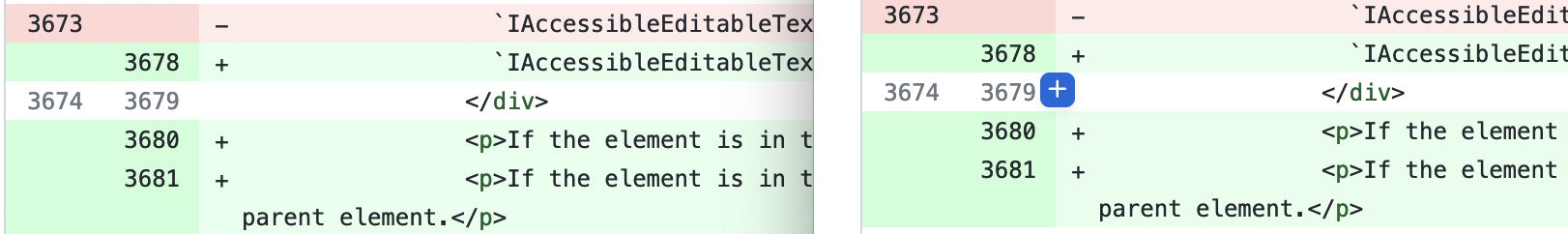
Each line of code can be commented on with a GitHub pull request. It would be overwhelmingly to visually display the a comment button on each line, so it is visually hidden until the line is hovered, or a specific one of the buttons receives keyboard focus.
These buttons also don't use the typical visually hidden class.
Or or, content might need to be visually hidden because someone wrote some rubbish call-to-action copy and the web page would otherwise be riddled with “learn more” or “read more” links that have no immediate programmatic context to their purpose.
Maybe a web app was designed in a way where one can infer the current page’s purpose due to the styling of the “current page link” in the primary nav - so there’s no visible heading to introduce the primary content of the page. Oh, and adding that heading in there would “degrade the design”, so cool. Guess we can insert a visually hidden heading to help screen reader users, at least, without disrupting the design which would be absolutely ruined and unusable if a heading was added. Horrible, horrible headings…
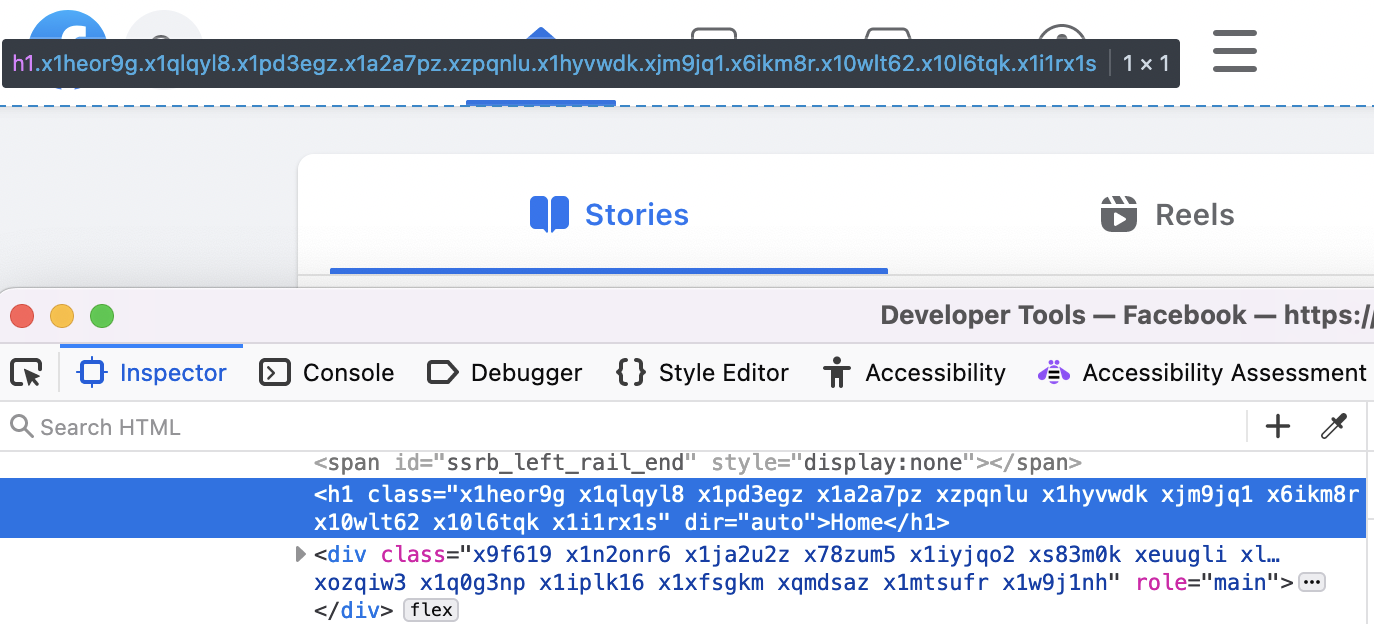
Rather than display the primary heading of the page, Facebook visually hides it.
The visually hidden technique appears to be used here, but has been obfuscated into various single-purpose compiled classes. .x1heor9g is a real banger of a utility class name, if I do say so myself.
Or or or, a website or web app requires a ‘global’ live region component. For instance, rather than having multiple live regions on a web page, a single live region is used to expose any dynamic updates that occur on the page. Live regions can be quite annoying to get right, so a persistent visually hidden live region is often used, waiting in anticipation for the momement they can inform screen reader users that “You must fill out your name. It is REQUIRED!!!! SURE I KNOW YOU’RE JUST TABBING THROUGH THE PAGE RIGHT NOW TO CHECK OUT WHAT THIS FORM INCLUDES, BUT DAMNIT I NEED YOUR NAME! I NEED IT NOW!!!! NOW!!!!!” I may have some thoughts about how aggressive many people have made web forms, with their basic on-blur error messaging logic.
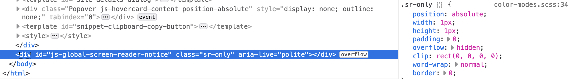
The most on the nose instance of the .sr-only class, being used to visually hide a global ARIA live region as the last element in a web page.
There are other instances of where you may want content to be hidden but available only for people using assistive technology, or only when the hidden content is actually relevant (e.g., a sub-navigation list of links). These would be different from the previously mentioned examples, as these would not be situations where the content should be treated as visually hidden. Rather, they would generally need to be hidden to everyone. Again, see my previous blog post for more information on stuff like that.
Sure does seem we need to visually hide stuff quite a bit?
If there’s a need for so many instances of visually hidden content, why wouldn’t it be standardized? Well, I mean standardized beyond the already existing ways to visually hide content:
color: transparentopacity: 0transform: scale(0)clip-path: inset(50%)- etc.
By themselves, each of these properties can be used to visually hide content per the situation, but someone might have to add a few extra property declarations, e.g., position: absolute, to get the content to no longer take up visual space in the document layout. Or, a combination of some of the above or other properties may be necessary to fit one’s exact visually-hidden needs. For instance, if creating a custom checkbox style, one might think to just use the standard visually hidden class.
However, as I've been noting for some time now and others have since mentioned, using the standard visually hidden class will introduce problems due to the 1px by 1px nature of the beast/ruleset.
Remember, not all screen reader users are completely blind. Some of these users, for instance, might be able to see or partially see a custom checkbox on their iOS or Android device. They might then think to try and press or drag their finger across their screen to “explore by touch” while the screen reader is enabled. However, they’d then be seemingly unable find this checkbox that visually appears to be there, but is really shoved off into a 1px by 1px square somewhere on the page, if not entirely positioned off screen. Fun! Good luck finding that 1px by 1px checkbox that might not even be discoverable in the viewport.
Heck, this problem would exist even for instances of not completely restyling a checkbox from the ground up (which also, unless you're going way out there with a custom style, we don't really need to do anymore.
Consider a button (such as a “more options”, or “edit”, “delete”, etc.) that is visually hidden in a ‘card’ or ‘row’ of content, where it only becomes visible on hover (generally of the whole container), or focus/focus-within the container. If the standard visually hidden class was used here, this too would suffer from the 1px by 1px problem. (You may remember I mentioned GitHub has a visually hidden comment button for reviewing PRs, but it doesn’t use the standard visually hidden technique. They don’t have this 1px by 1px problem!)
A standardization of the ruleset wouldn’t help with these situations. Actually, it’d probably make the problem more prevalent, since many developers would (understandably) think all they needed to do was to set this fabled single property, and all their accessibility problems concerning content that needed to be hidden would go away. Just like ARIA, it’s there to make your content more accessible.
Wait… what? ARIA gets used in situations where it is either unnecessary or not appropriate for the use case? Shocking.
What about fixing the underlying problems instead?
Getting caught up in how to make visually hiding content easier for developers to implement (you know, so they don’t have to copy/paste a class name), imo, is missing the mark on solving the real issue. We “need” to visually hide content because of gaps in the design of the UI, or because of features which are lacking from browsers.
For many of the examples called out earlier, what if those gaps were solved instead?
Skip to content links are also a dirty hack
We shouldn’t need skip to content links. Rather, what would be way more useful that including a visually hidden link at the top of every website, is if browsers would support navigation by elements that are exposed as landmark roles. At the very least, allow for a mechanism to directly move focus to the content of the main element/landmark. Alternatively, allowing for quick navigation by headings would be pretty awesome, too.
Implementing one of those ideas could negate the need for skip to main content links, at least. You don’t need to visually hide something that isn’t necessary to implement, after all.
Styling form controls isn’t as bad as it used to be
Yes, visually hiding a form control so that a custom styled ‘faux’ control can be rendered in its place is rather common. But as mentioned, the standard visually hidden ruleset is not what you should be using to effectively hide the few controls that even allow for this hack. Also, wouldn’t it be far better if time was instead spent trying to push proposals like a new checkbox element over the line?
IMO, new checkbox and radio elements are not the most important features we need on the web. But if given the option between those and a standardized visually hidden feature, yes. Please. New checkboxes and radios. Solve for the problem, not the symptom.
Regarding aria-label and insufficient CTAs
A web page containing a bunch of buttons or links with, for example, “edit” or “learn more” visible text, and thus accessible names, can be rather rubbish depending on the way one is navigating the web page.
For instance, a page listing article or product previews, each with with a “learn more” call to action link. Without extra development effort, all these links will simply be exposed as “learn more” when someone navigates by focusable elements, or uses their screen reader to navigable specifically by links.
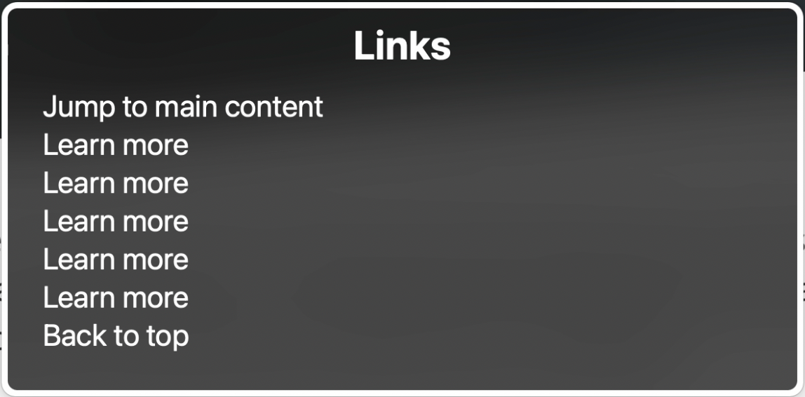
Before you follow these links to learn more, you're going to need to learn more about what you'd be learning more about.
Code for what could produce the above link listing might look something like this:
<div class="card-or-whatever">
  <h3>Here's some descriptive text but lol, I'm not a link!</h3>
  <p>Fluffy fluff fluff tells you stuff about the fluff.</p>
  <p><a href=...>Learn more!</a></p>
</div>
In these contexts where the link serves as a standalone CTA outro to UI elements like ‘cards’, these can be flagged as 2.4.4 Link Purpose (In Context) failures. This is because the CTA is not programmatically associated with other text (e.g., a paragraph) to help provide the context as to what one would be learning more about.
This is why such CTAs are commonly recommended to use the visually-hidden technique to provide more context. For instance,
<a href=...>
  Learn more
  <span class=visually-hidden>about whatever yada yada</span>
</a>
However, while often used to alleviate this lack of context, there are other avenues we could be considering, instead.
For example, aria-label and aria-labelledby can allow for the same context to be provided, without the need for the visually hidden hack.
<a href="..." aria-label="Learn more about something">
  Learn more
</a>

...

<p id=thing>My address, or whatever</p>
...
<button id=self aria-labelledby="self thing">
  Edit
</button>
Granted, right now translation services and aria-label continue to have issues, and using aria-labelledby has the problem that it necessitates the use of IDs, and developers hate IDs.
So, maybe ARIA isn’t an option for you. But you know what that leaves? Making a better design.
For instance, I’ve already referenced the Nielsen Group article “Learn More” Links: You Can Do Better, but I will do so again because it is worth repeating.
Take a look at many popular news aggregate websites (well, look at them just in the context of this train of thought… I can’t endorse them otherwise, unless you’re looking to significantly up your anxiety and tank your mood. News sites do that great.). Many of which I’ve reviewed show they’ve since moved away from the “learn/read more” CTA approach and instead treat the concise but descriptive titles/headings of their article previews as the links to their content.
“But Scott, user testing has shown that CTAs get more clicks”
Well sure, I didn’t think we needed a test to determine if someone sees a big button-looking control that screams “click me”, they will click it. But visual cues to visually promote “click me” behaviors don’t “need” to impact the accessibility of the content.
For instance, there’s no reason one couldn’t implement a CTA as more of a decorative element that still allowed for pointer events to activate it. A very quick example (and one of the demos even still has the lovely ‘read more’ appear on hover/focus):
See the Pen simple cta article 'card' by Scott (@scottohara) on CodePen.
I’m sure many could come up with more creative designs than that five minute codepen. But maybe take this as a challenge. Accessible design doesn’t need to be boring, rather good accessible design demands creativity. So, be creative and move away from the uninspiring learn more links and visually hidden hack.
We need a notification API
Live regions are finicky, and having to implement a visually hidden live region to act as a notification center for a website/web application is yet another hack built atop a shouty house of cards.
Rather, if we had a notification API, we wouldn’t need to visually hide live regions at all. Rather, we would be able to dynamically render the content we want on our web pages, and then use the API to ensure the rendered text content, or maybe even something more concise/informative than what is visually rendered, could be exposed to the accessibility tree. No reliance on DOM elements, no problems where the live region that should have handled this is within an inert or aria-hidden=true subtree because a modal dialog opened and blew your aforementioned shouty house of cards down.
<dialog>
  Imma be a modal dialog!

  <button>
  	Press me and make a toast show up,
  	but LOL don't expect to hear it!
  </button>
</dialog>

...

<div class=visually-hidden aria-live=polite>
  Inject whatever you want into me, and I'll typically
  announce it. But, I'm not saying
  "boo" if that modal dialog is open!
</div>
You want to get around this? Either don’t use the native dialog element (which would be quite a shame, as using it responsibly can be far better than creating your own). Or, put another live region into your dialog, so your page can continue to shout things while the modal dialog is open and everything outside of it is treated as inert.
Wrapping up
For better and worse, we will have instances where we need to visually hide content to mitigage a gap in the visual design. That’s not to say that every gap is necessarily due to a failure to incorporate accessibility in the design process. Rather, because there is a balance that needs to be maintained between what is visually presented, vs what is programmatically conveyed, sometimes the best way to work around that is to inject content that is specifically for people using assistive technology.
Them’s the breaks.
But, as I’ve hopefully illustrated by now, while there is a common ruleset for visually hiding content, codifying that to me seems more of a silent acknowledgement that a hack is the best we can do. I don’t agree. The web should be better than that.
- We should be able to navigate to landmarks (e.g., skip to main content) by default browser commands.
- We should be able to send dynamic messages to assistive technology, without having to rely on fragile, invisible, live regions.
- We should be able to use
aria-label(and alsoaria-description) without having to worry about translation services. - We should be able to fully and easily style common form controls.
- And we shouldn’t need to introduce a native way to do all these things, which covers various use cases for visually hidden content, but not all of them.
Introducing a native mechanism to save developers the trouble of having to use a wildly available CSS ruleset doesn’t solve any of those underlying issues. It just further pushes them under the rug. Additionally, it introduces an “official” way to hide content which at best, might not be the right way to hide content for a particular use case. And at worse, it provides a hiding mechanism for people to misuse. Content that should be hidden to everyone could get the “well, isn’t it more accessible if we never truly hide content, so that screen reader users can always have access to everything at all times?”
No. That’d be quite problematic. And while paraphrased, that is a question I’ve been asked, when having to mention to someone that they’ve incorrectly hidden content. While this thinking comes from a good place, it is exactly what we don’t want to happen.
Now, one might say that education and examples are the ways to promote correct usage. And that person would be right. But also, if documentation and providing official examples would mitigate misuse and misunderstandings, then we wouldn’t need stack overflow or slack channels for people to post questions, daily, or online courses to explain to developers what existing free resources already cover.
Anyway, that’s it. Those are my very not-hidden thoughts on the topic. Thanks for reading all these yucky words. So so many words…